Report Date: 2023-09-08
The TradeWave report for Genuine Parts (GPC), shows an opportunity between Sep 8th and Feb 17th. This report provides an in-depth analysis of the date range, highlighting key TradeWave patterns in the price movements of GPC during this period, along with supporting historical data and charts. This information can be used by investors and traders to study potential trading opportunities, manage risk, and make informed trading decisions.
Load on Wave Viewer
Genuine Parts TradeWave Opportunity Key Informationi
The financial market is an ever-changing landscape, and investors need to stay on top of key indicators to make informed decisions. The key stats included in this report aim to provide investors with a quick and comprehensive overview of the TradeWave opportunity and its quality. Below is a detailed explanation of each key stat and its significance to help investors understand the information presented in the report.
Symbol
GPC is the unique ticker symbol that identifies the financial instrument analyzed in the report. Each symbol corresponds to a specific financial instrument such as a stock, ETF, or futures contract.
Trade Direction
This stat indicates the recommended trade direction for the financial instrument. It can either be long (buy) or short (sell). The recommendation is based on analysis of the financial instrument’s performance over the date range opportunity. The trade direction is one of the most important key stats to consider, as it indicates the expected price movement for the financial instrument in the coming days or weeks.
Date Range
The date range indicates the period over which the financial instrument is analyzed. It includes the start and end dates of the opportunity being analyzed. This information is key in determining the performance of the instrument during a particular time frame.
Days Held
It is important to understand, TradeWave defines date range as start-date and days-held. The end date for the date range is derived from start-date and days-held. This stat shows the number of days that the financial instrument should be held after the start day of date range opportunity. It helps investors determine the expected holding period for the trade and plan their investment strategy accordingly.
History Years
The history years stat indicates the number of years of historical data that the report is based on. This report is based on 10 years of historical data. It is important to consider the history years when interpreting other key stats, as a longer history provides a more comprehensive picture of the instrument’s performance.
Securities Group
This stat identifies the security group to which the financial instrument belongs. Securities are grouped together based on their similarities, such as sector, industry, or asset class. Understanding the security group can help investors assess the instrument’s overall performance in comparison to others in the same group.
Number of Losers
This stat displays the number of losing trades during the date range opportunity. It is an important indicator of the instrument’s risk and can help investors understand the potential downside of their investment.
Number of Winners
This stat displays the number of winning trades during the date range opportunity. It provides an insight into the instrument’s potential profitability and can help investors assess their expected returns.
Percent Profitable
This stat displays the percentage of profitable trades during the date range opportunity. It is calculated by dividing the number of winning years by the total number of years. A higher percentage indicates a more profitable opportunity.
Average Profit
The average profit is a key statistic that provides an important overview of the profitability of the financial instrument. This stat is calculated by dividing the total profit from all trades during the date range opportunity by the total number of profitable trades. A higher average profit is generally considered to be a good indication of a profitable trading strategy, as it suggests that more winning trades were made than losing trades. However, it is important to note that this stat should be considered in conjunction with other key stats to fully understand the performance of the financial instrument. The best opportunities have a high average profit and a high Sharep Ratio.
Average Loss
This stat displays the average loss per trade during the date range opportunity. It is an essential risk management metric and can help investors understand the potential downside of their investment.
Biggest Winner
This stat indicates the largest winning trade during the date range opportunity. It is an important indicator to understand how the results have been influenced by outliers.
Median Profit
The median profit is another important statistic that provides insight into the performance of the financial instrument. This stat is calculated by finding the middle value of all the profits made during the date range opportunity. The median profit is useful in cases where there are significant outliers in the profit data, as it is less sensitive to extreme values than the mean or average profit. A higher median profit is generally considered to be a good indication of a profitable trading strategy, as it suggests that a significant number of trades made a profit. When Median Profit is close to Average Profit, the opportunity shows stability in profits over the years.
Standard Deviation
The standard deviation is a key statistic that measures the variability of profits and losses during the date range opportunity. A higher standard deviation indicates that there is a greater variation in the profitability of trades, which may indicate a higher level of risk associated with the trading strategy. On the other hand, a lower standard deviation indicates a more consistent level of profitability, which may suggest a lower level of risk. Look for opportunities with High Average Return and low Standard Deviation.
Cumulative Return
The cumulative return is a measure of the total return on investment for the date range opportunity. This stat takes into account all profits and losses made during the trading years (10 year in this repor) and provides an overall measure of the profitability of the trading strategy. A higher cumulative return is generally considered to be a good indication of a profitable trading strategy.
Sharpe Ratio
The Sharpe ratio is a key statistic that provides a measure of risk-adjusted return. This stat takes into account both the profitability of the trading strategy and the level of risk associated with the strategy. A higher Sharpe ratio is generally considered to be a good indication of a more successful trading strategy, as it indicates that the returns generated are greater than the level of risk taken. However, it is important to note that a high Sharpe ratio does not necessarily guarantee a profitable trading strategy, as it is just one of several key stats that should be considered. When analyzing TradeWave opportunities with large number of historical years, Sharpe Ratio value will be likely lower.
Long Wave Score
The Long Wave Score is the current uptrend score for the financial instrument. It is based on AI model derived from current techncal data and provides a snapshot of the instrument’s recent behavior over the past 7 to 14 days. A higher Long Wave Score indicates that the financial instrument has been trending upward recently, and a lower score indicates the opposite. This score can provide valuable insight into the current momentum of the instrument and can be useful in making informed decisions about whether to buy or hold the instrument.
Short Wave Score
This stat measures the current downtrend score for the financial instrument. Like the Long Wave Score, it is based on current data and provides a snapshot of the instrument’s recent behavior over the past 7 to 14 days. In most cases, the sum of the long and short scores will add up to 100%. When the Short Wave Score is higher than the Long Wave Score, it may indicate a downward trend, while a higherLong Wave Score may indicate an upward trend.
Summary
These key stats are derived from historical data for the financial instrument, with the exception of the Long Wave Score and Short Wave Score, which are based on current data and provide a snapshot of the instrument’s recent behavior over the past 7 to 14 days. By analyzing these key stats, users can gain valuable insights into the performance of the financial instrument and make informed decisions about whether to buy, sell, or hold the instrument.
The key stats included in this report provide a comprehensive overview of the financial instrument’s performance, including its historical performance, recommended trade direction, date range, days held, securities group, number of losers and winners, percentage of profitable trades, biggest winners, average loss and profit, median profit, standard deviation, cumulative return, Sharpe ratio, long score, and short score. By understanding and interpreting these stats, users can make informed decisions about the financial instrument and optimize their investment strategies accordingly. Whether users are experienced traders or new to the market, these key stats can provide valuable insights into the performance and behavior of financial instruments and help them make profitable investment decisions.
| Symbol | GPC |
| Trade Direction | Long |
| Date Range | Sep8-Feb17 |
| Days Hold | 163 |
| History Years | 10 |
| Securities Group | S&P 500 STOCKS |
| Num Losers | 0 |
| Num Winners | 10 |
| Percent Profitable | 100% |
| Biggest Winner | 11.78% |
| Avg Loss | 0% |
| Avg Profit | 7.36% |
| Median Profit | 8.19% |
| Std Dev | 3.97% |
| Cumulative Return | 102% |
| Sharpe Ratio | 1.41 |
| Long Wave Score | 20 |
| Short Wave Score | 80 |
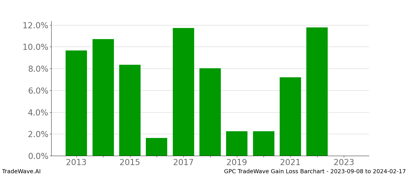
GPC Gain Loss BarCharti
The displayed chart provides information about the profitability of purchasing GPC on Sep 8th and selling on Feb 17th, showing the percentage gain or loss. A closer analysis of the chart can reveal details about the TradeWave opportunity and its profit pattern. The chart’s bars are color-coded with green for bullish outcomes and red for bearish ones, reflecting the corresponding year’s performance. A majority of green bars on the chart usually indicates a strong bullish TradeWave pattern. On the other hand, bars of significantly different sizes may signify inconsistency in profits, which can be characterized by the stats shown by Standard Deviation.
Moreover, the Sharpe ratio is a critical indicator of consistency that should be noted while analyzing the barchart. A large Sharpe Ratio implies consistent profits from year to year, indicating lower risk. Typically, Sharpe Ratios of 1 or higher reflect a more consistent year-to-year positive profit outcome on the chart. However, it is essential to note that the relative value of the Sharpe Ratio varies when analyzing TradeWave Opportunities derived from a different number of years than 10, as is the case in this report.
It is crucial to note that the historical data displayed on the bar chart encompasses a period of 10 years. Therefore, when assessing the Sharpe Ratio, it is important to be aware of the impact of the number of historical years on the relative value of the ratio. A quick glance at barcharts may suggest that one should look for mostly green bars that are consistently profitable, but not exhibiting huge differences from year to year. Such a pattern may indicate a strong TradeWave pattern worthy of consideration.
In conclusion, analyzing the chart displaying the percentage gain and loss of GPC when purchased on Sep 8th and sold on Feb 17th can provide valuable insights into the TradeWave opportunity and its profit pattern consistency. The color-coded bars of the chart reflects the corresponding year’s performance, with green bars indicating a bullish outcome and red bars representing a bearish one. The Sharpe Ratio is an essential metric for gauging the consistency of profits over time. While analyzing barcharts, one should look for mostly green bars that are consistently profitable and indicate a strong TradeWave opportunity, which is worthy of consideration.
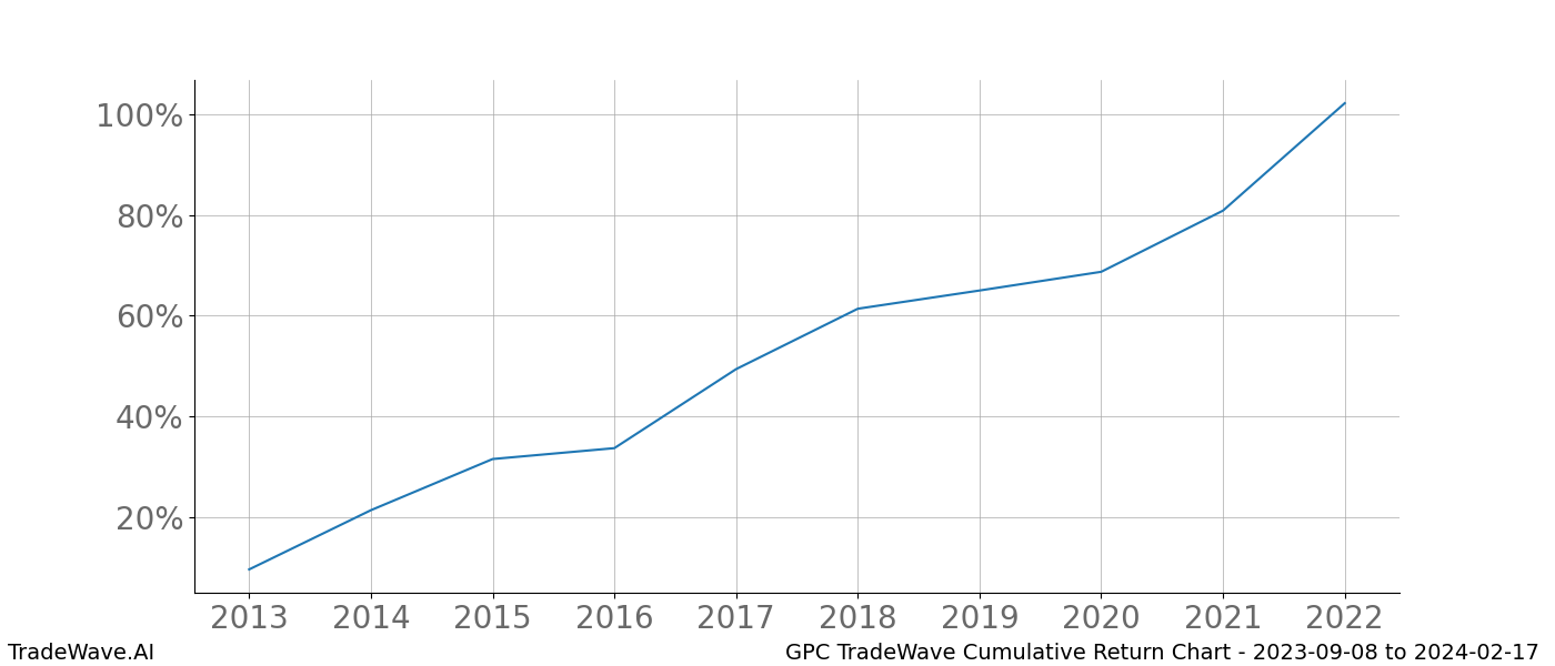
GPC Cumulative Return Charti
This chart shows Genuine Parts GPC, cumulative growth between dates Sep 8th and Feb 17th over the past years. A user can easily visualize the relative performance of GPC compared to other financial instruments during this time period.
The cumulative chart displays the total return, including both capital gains and dividends, giving traders a clear view of the long-term trend of GPC’s performance. By analyzing the data, traders can identify which instruments have consistently grown over the period and which ones have underperformed.
The cumulative chart is particularly useful for evaluating similar financial instruments, such as stocks in the same sector or ETFs tracking the same index. Traders can compare the cumulative growth of these instruments and identify which ones have performed better or worse than their peers.
Moreover, the chart can help traders evaluate the performance of a single financial instrument over different periods, such as one or five years. This helps identify trends and patterns, making it easier to decide when to buy or sell.
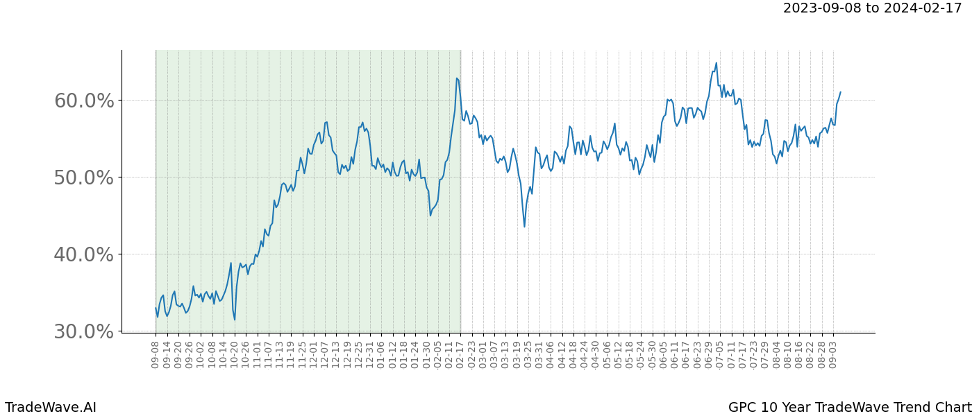
GPC 10 Year TradeWave Trend Charti
A TradeWave Trend chart is a powerful tool for investors and traders seeking to gain a deeper understanding of the overall trend of a given security, including GPC, throughout the year. This chart showcases the detrended average of a security’s price movements over a number of years, which can range from 5 to 95 years, depending on the available data. In this report, the period is set to years, enabling traders to spot Wave patterns and trends that have repeated over the past years.
When looking at the Trend chart for GPC, the user is presented with a clear picture of the average trend throughout the year, along with a window of opportunity that reflects the date range of the report between Sep 8th and Feb 17th. The chart is designed to identify sharp uptrends or downtrends during the report date range and to understand where that range fits into the overall average trend of GPC.
At the start of the year, the chart displays the security’s price movements from January 1st to December 31st. However, as the year progresses, the initial date on the chart is shifted to two months ago, rounded to the first day of the month, to ensure the window of opportunity remains inside the chart. This provides traders with a current and up-to-date view of the market.
The TradeWave Trend chart is an informative tool that traders can use to determine whether the current date range presents the best time to enter a trade. By analyzing the chart, traders can identify trends and patterns in GPC‘s price movements and make informed trading decisions.
It’s worth noting that the window of opportunity may, at times, reveal an initial sideways or downtrend before resuming an uptrend. In such cases, the trader can load the date-range on the Wave Viewer and adjust the window of opportunity displayed on the average TradeWave chart. By shifting the start date to a later date in the future, traders can observe whether the stats improve and whether waiting may enhance the profitability and risk of the trade.
The TradeWave Trend chart is an invaluable tool for traders looking to gain insight into the repeating trends and patterns of a security’s price movements, including those of GPC. By using the TradeWave Trend chart, traders can make informed trading decisions based on historical price movements and the current market state. By keeping an eye on the window of opportunity and adjusting the start date as needed, traders can optimize their trades and maximize their profits. This makes the TradeWave Trend chart an indispensable resource for investors and traders alike.
Investors and traders are constantly seeking ways to gain an edge in the markets. One often overlooked approach is TradeWave analysis, which involves examining historical patterns in an asset or market price movements during specific periods of the year. TradeWave.AI is a specialized platform that provides TradeWave analysis and reports to help investors and traders identify potential TradeWave opportunities.
One of the major benefits of using TradeWave analysis is that it helps investors and traders anticipate market movements and plan accordingly. Certain assets tend to perform better during certain times of the year due to factors such as weather patterns, holidays, or economic events. By understanding these patterns, investors can identify potential buying or selling opportunities and adjust their portfolios.
The TradeWave report offers a detailed analysis of GPC‘s historical price movements during the opportunity date range, as well as insights into how other related assets or markets have performed during this period. However, it’s important to keep in mind that past performance is a guide and not always indicative of future results. While historical patterns are useful, market conditions can change rapidly and TradeWave patterns may go against the past years.
TradeWave provides valuable resources for investors and traders who want to gain a deeper understanding of TradeWave patterns and opportunities in financial markets. By using this information to inform their trading decisions, investors can potentially increase their chances of success and achieve better returns on investments.
Top 10 Today
Wave Viewer: Discover Trading Opportunities for all Financial Instruments
TradeWave Analytics 101